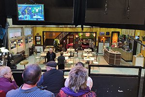
A sitcom set is a character too
Dave Cohen explains how 'lumps of wood' are some of his favourite characters (he's talking about sitcom sets)...
There's a character in every audience sitcom that rarely gets a mention, yet has the potential to be one of the most useful members of your cast. Every sitcom has them, but most writers don't bother to give them the attention they deserve and require. I'm referring to: the room.
It's not any old room, it's your "sit". That's already half of what you're trying to write, so you should give it a good deal of thought.
A chair
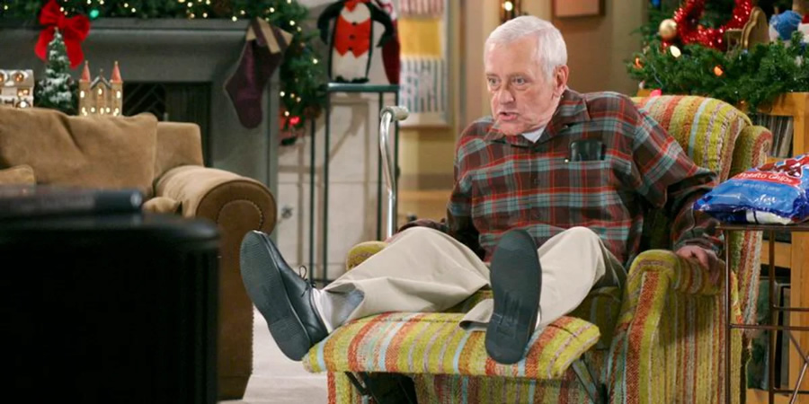
In the opening minutes of the pilot episode of Frasier, the writers introduce us to Frasier's stunning, arty, European-style flat. Martin, his working-class retired cop dad, comes round for the first time and is unimpressed. "Nothing matches" is all he can say. "It's eclectic!" is Frasier's defensive response.
Within a few minutes, not only are all the characters perfectly established, but we find out that Martin will be moving in with Frasier. And with no prior warning, Frasier has to watch, horrified, as Martin's hideous easy chair is wheeled into the centre of the room. 'It's eclectic' he tells his furious son.
And there the chair stays, for the next 200 or so episodes, a visual representation of so much of the comedy of that show - an inconvenient and garish carbuncle plonked in the middle of Frasier's perfect world, the physical representation of Martin so that even when he's not in the room that chair is a constant reminder of Frasier's seemingly ideal life, forever intruded on by his father.
It's a wonderful example of how you can add layers of meaning to your script without having to write any more words. And it's a great way for drawing you back to the sitcom every week. One of the things you're always trying to do as a sitcom writer is create a universe that audiences want to keep returning to. There's something comforting and grand about Frasier's flat, it's always interesting to look at - but that bloody chair is always centre stage, a funny reminder of how Frasier and his dad are always close, always clashing.
The same applies to screenplays. Much of the genius when it comes to memorable sets is down to the set designer, working on the stage in the days before the shoot with the director and producers to create something that looks exactly right for the movie.
A desk
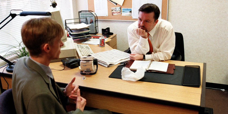
You can help the set designer. I recently read a sitcom script by a new writer set in the world of entertainment TV production. Using a few words to describe the desks of the male and female producer he brilliantly and hilariously created a world, while setting up two of the lead characters without them even being in the room.
The woman producer's desk was tidy and efficient, all colour-coded folders and neat piles of scripts. The man's desk was a file-free zone, but was covered in wacky toys and gadgets. I worked for many years on Channel 4's Big Breakfast show, and there was a constant battle between clever, funny and brilliant women trying to get a show made and male producers who worshipped Chris Evans and Johnny Vaughan, and arsed around with the toys on their desks while taking credit for any success regardless of their contribution.
If you're not already famous in another field of writing, the first screenplay you sell is unlikely to be greenlit with a multimillion dollar budget, which makes it worth your while thinking hard about where most of the action takes place, and how you can use that to comic or dramatic effect.
We tend not to think too much about the "sit" because it doesn't seem as important as characters or plots or jokes. But it can help you establish some of those characters and jokes, as well as the world you want people to come back to.
A table
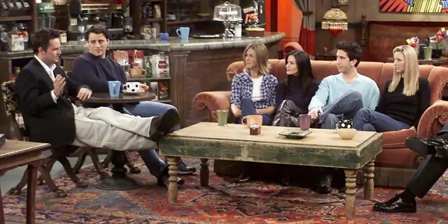
This is especially true with audience sitcoms, which are limited to two or three main sets. That's what your audience sees week in, week out. Jerry Seinfeld's flat is another great example of a room that is part of the show. There's nothing unusual about it, but it's the place where everything begins and ends - the comedy stage. Jerry is the host, "master of his domain", the MC of the room, and each of the three regulars is given a large free space to shine, gesticulate and stomp around.
By complete contrast, in the other main set of the show, the cafe, everyone is cramped round a tiny table. This is where the rudeness is often at its funniest, when the four of them are literally within spitting distance of each other.
Meanwhile, the cafe as social space, which in Seinfeld felt like a familiar and universal representation of what a 20th century cafe was like, was about to be transformed by Friends. That show established the coffee shop as a happening place for young pretty people to meet. When I was their age you went to a cafe for nothing more romantic than a fry up. You certainly didn't go to hang out, or heaven forbid, drink their disgusting coffee.
Without Friends, the Starbucks culture may never have happened. I'm not asking whether that's a good thing, merely pointing out the enormous impact of Central Perk, and how that "sit" added one more layer of meaning to one of the most successful sitcoms ever.
When I'm watching a British audience sitcom my attention sometimes wanders, but even if that had happened during an episode of Frasier (it rarely did), my eyes would have been drawn to something relevant to what I was watching - a stunning work of art, a beautiful table, oh, Martin's hideous chair.
A sofa
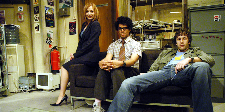
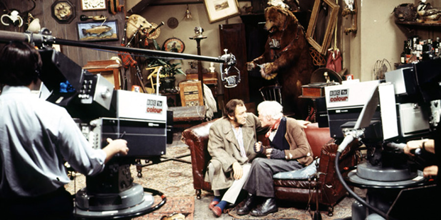
In British sitcoms the distraction might get me annoyed. Why is that living room sofa the same as every living room sofa I've looked at in every audience sitcom since 1973? What is this room telling me about the people who inhabit it? Nothing, that's what. But I could still describe to you the Steptoe household, what an amazing set, a surreal yet totally believable representation of what an old rag-and-bone man's house may have looked like. They frequently spent entire episodes in that one room.
Why does your character act in a certain way? Is there too much clutter in her life, so she misses something important? You can show that in a room. A big pile of unopened mail in a corner would do it: occasionally looked at, then run away from.
Is everything in place, perfectly, too perfectly? Is this person a control freak? Again, as the attention of the audience wanders it can suddenly be brought back in to focus by a tiny movement from our main character, to correct something that looks slightly out of place, but only to them.
Next time you watch a movie, look at the work that goes into the rooms that are used regularly. If it's a British movie, I bet you can come up with half a dozen ways of improving it.
For more articles on defining characters, see BCG Pro's Inside Track Library
This article is provided for free as part of BCG Pro.
Subscribe now for exclusive features, insight, learning materials, opportunities and other services for comedy creators.


