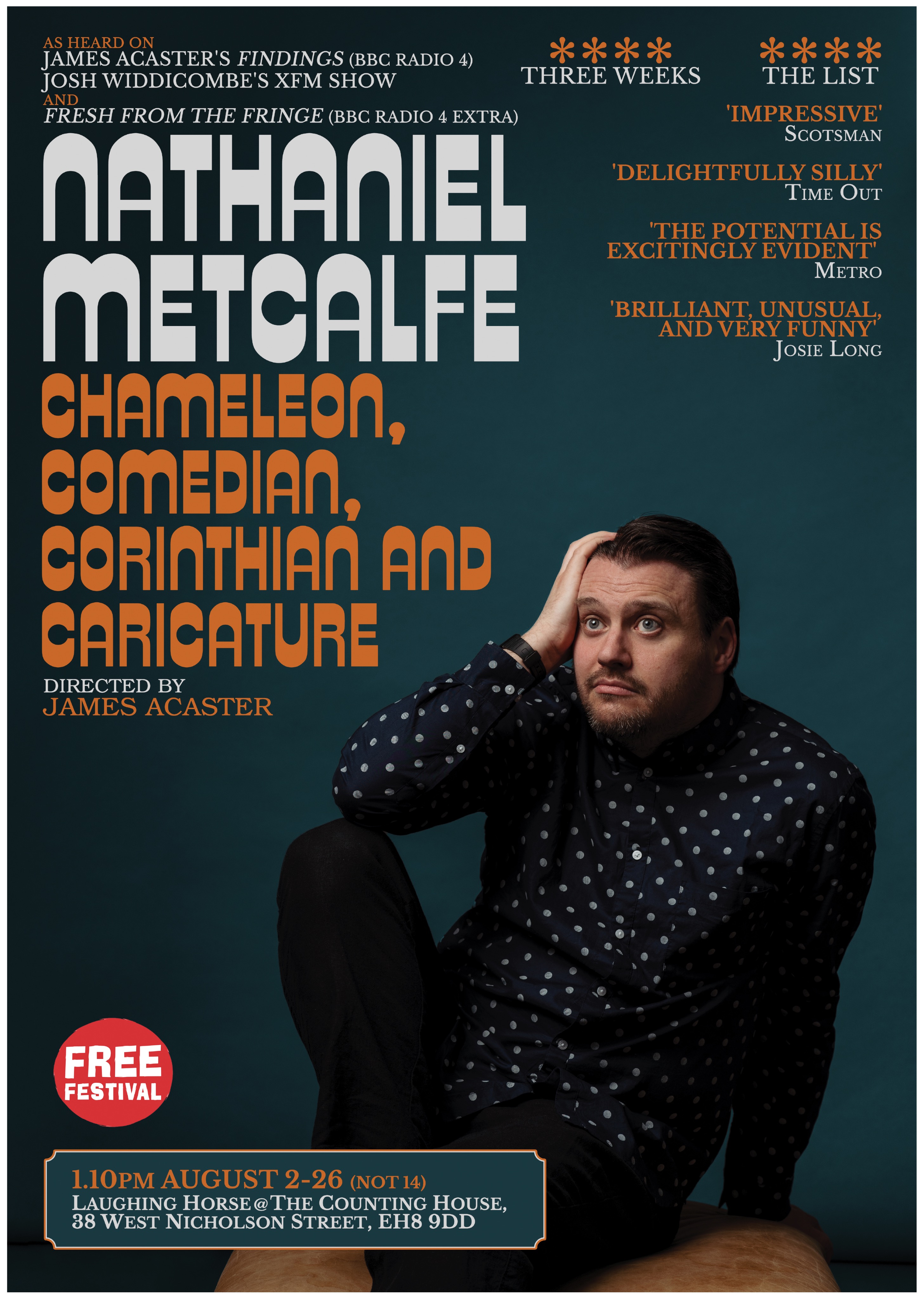
The show's title is named after a lyric from the David Bowie song "The Bewlay Brothers" from his Hunky Dory album. I wanted to reference Hunky Dory without it looking like a pastiche. My photographer and designer Edward Moore suggested we go back to the photograph Bowie himself was referencing on the album cover, a still of Marlene Dietrich in the film Angel. I loved this idea immediately. I feel like it pays homage to both without being obvious. The last thing I wanted to do was a very obvious reconstruction of the Hunky Dory LP sleeve. That said we did use its typeface to inspire our own. It also has a very pleasing & interesting looking capital N which particularly appealed to me because it's my initial. The shirt I wore is similar to Bowie's but the trousers closer to Dietrich's. The brown type is to match the seat I'm sat on & adds some warmth to the blue of the rest of the poster. I wanted the box at the bottom to resemble those used on the Top of the Pops albums, as another 70s LP reference.
- Designer
- Edward Moore
- Photographer
- Edward Moore
- Show
- Nathaniel Metcalfe: Chameleon, Comedian, Corinthian and Caricature

